
Mind at Bay
Concept and creation of a personal portal for DBSA (Depression and Bipolar Support Alliance) of San Francisco. Using resources provided by DBSA and tailoring to create a more personal, comprehensive and accessible platform for future users.
Product Provided
Progressive Web Application
Business Type
Non-Profit
-
![]()
My Role
Ideation
Journey & Site Map
User Flows
Mid-Fidelity Screens
Branding -
![]()
Client Vision & Goals
Continue to provide hope, help, education, and free peer support.
How might we remove the barriers of cost and access to care, and empower individuals to self-manage their mental health?
-
![]()
Tools Used
Figma/Figjam
Google Forms
Useberry


Problem Space
According to the CDC, more than 50% of Americans will be diagnosed with a mental illness or disorder at some point in their lifetime. With the rising costs of healthcare and a shortage of therapists, many people move through life untreated or even undiagnosed.
Solution
Motivate people to track their mental health, make changes to improve it, and find relevant resources, while being accessible.
MVP must include:
Self-assess with easy-to-use tools
Dedicated support resources for the underserved
Can join from anywhere

Dig into the Process
-
Secondary Research
Competitive Analysis- What can we gather from DBSA and similar organizations to improve user accessibility?
Starting with a very broad approach, each team member focused on one of the following overarching themes.Check out our key takeaways with a quick summary below.
Current DBSA Website & Mobile App:
App not currently in use, the website has a plethora of resources but how will someone find them if they don’t know they are housed here?
Support Sites/Top Searches:
Useful stories of others with shared experiences were great but hard to find, and impossible to leave comments on.
Other Mental Health Apps:
Some requested insurance and charge a fee. Others were a great inspiration for future development and UI features.
Access for All:
Exploring what does access to all mean. Is mobile access accessible to all? How might we make DBSA more visible in places that have free access like local libraries. -noted for later discussion.
Primary Research
18 Participants
37.5% found it hard to find relevant mental health resources
64.7% would stay up to date with extracurricular and volunteer events in their community
-
Brain before the storm, with the limited time we started by listing assumptions, and barriers based on our time frame to create some refined design perimeters.
How Might We remove barriers and cost and access to care, and empower individuals to self-manage their mental health?
Making notes, DBSA previously had a Wellness Tracker app named Bipolar App of the Year by Healthline Magazine in 2016. Since DBSA is a volunteer based service, this app was not easy to maintain and eventually stopped working and being used.
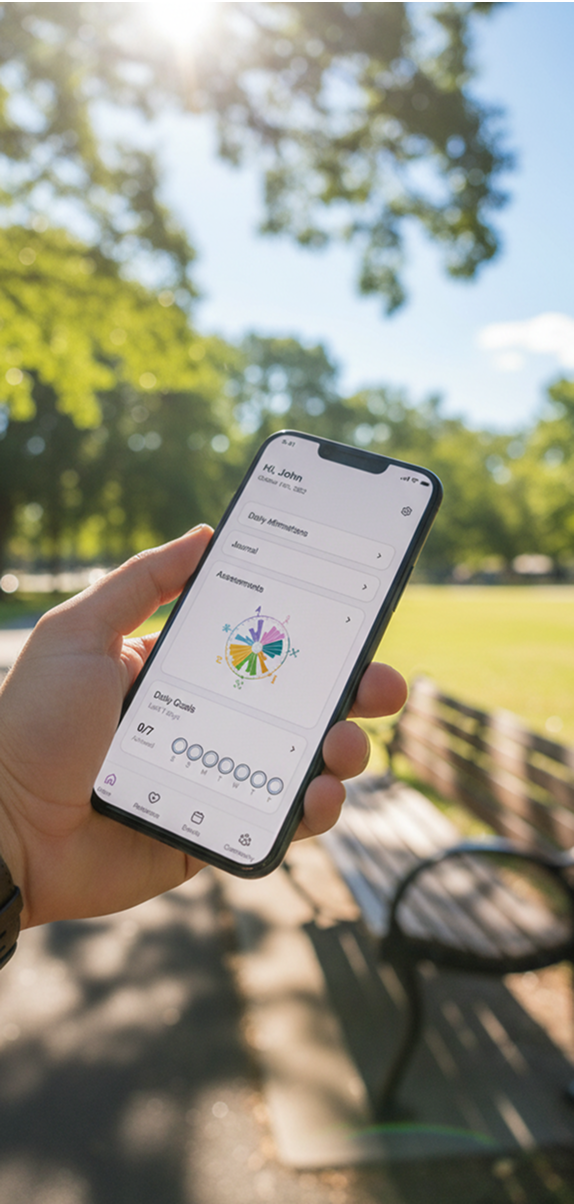
Site Map
Using the vast resources provided by DBSA we decided that the MVP for the app navigation needed 4 components: Home, Resources, Events, and Community.
User Flows
Flows were created based on one user’s journey from the home screen to each of the navigation components. These were limited to one activity that was completed within each component due to time constraints.
-
Using our navigation bar as our guide we quickly created a variety of sketches based on standard screen layouts to help make information easy to view without being overwhelming. These low-fi creations quickly became to screens used in the prototype below.
Style Guide
DBSA’s logo contains a vibrant blue they wanted to keep incorporated within the app design. With the combination of the colors used from another element on DBSA’s website, the wellness wheel (pictured below), we decided to also incorporate a rich deep purple with hints of a peachy orange to assist in creating an overall calming color palette.
Branding
What’s in a name? We decided to change to app from a Wellness Tracker to something more elevated which started as BetterMind and later moved to Mind at Bay to connect more with the userbase. Tying back to the Bay Area pride of San Francisco. -
Explore what access for all could really mean in a broader concept, by removing technology.
User testing/interviews, learn what would make this a go-to app for users.
UI development- explore consistency within specific tools.
Explore legal use of concept name and logo.
Final Thoughts
After the 2-day hackathon, with 21 total teams, our group placed 2nd overall, demonstrating that our research led to human-centered design.
For six months, a team of 12 designers, including myself, worked to create an easy-to-maintain progressive web app that allows users to access educational resources with ease while also finding a support group and a safe place to document their mental health journey.
Notes
Designs shown were created for client visualization. Some has since been iterated on and are not representative of the final outcomes.